· SOMEGA ·Consistency in every frame.
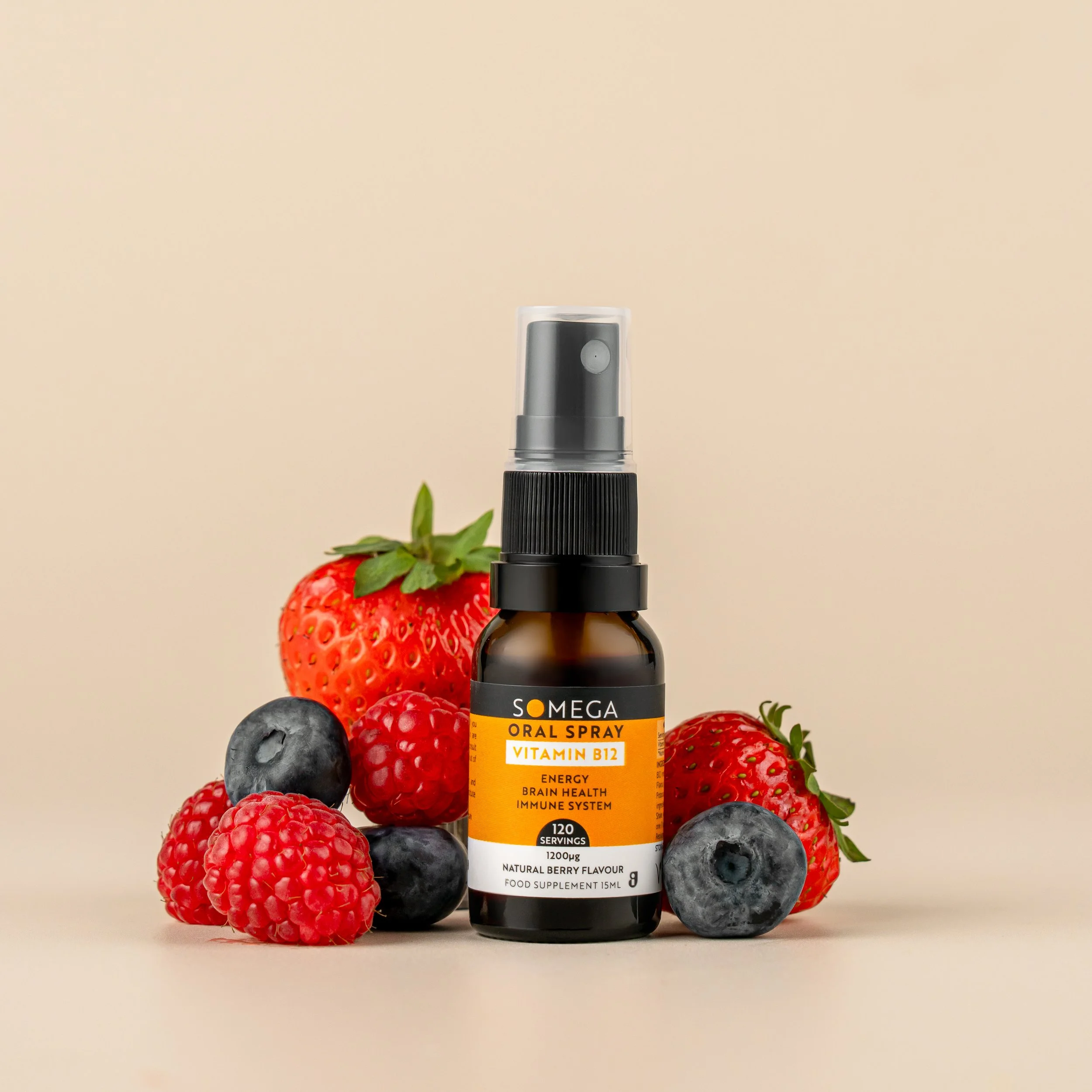
When a brand already has a strong visual identity, the photography doesn't need to reinvent it. Our work with Somega is about creating clean, consistent imagery that lets the products, colours and packaging do the talking.

01 · A STRONG FOUNDATIONLet the branding lead.
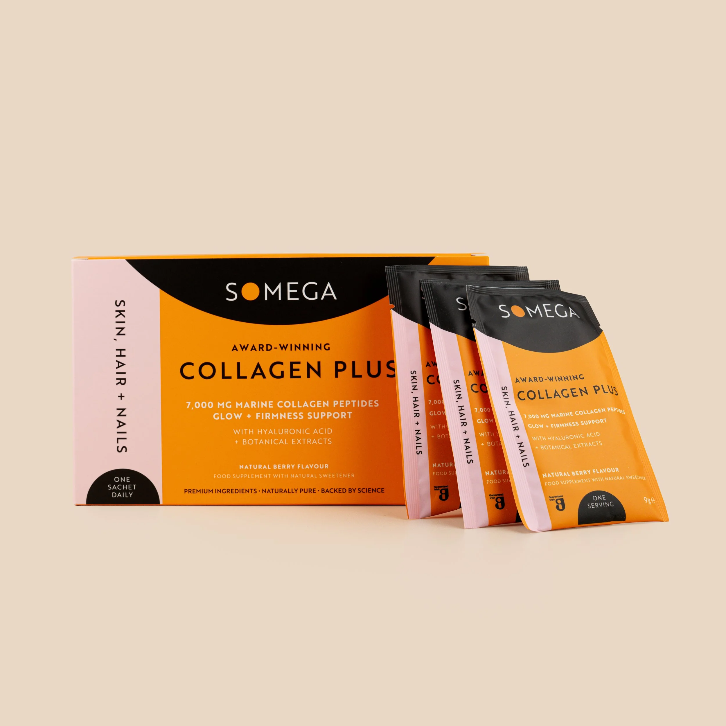
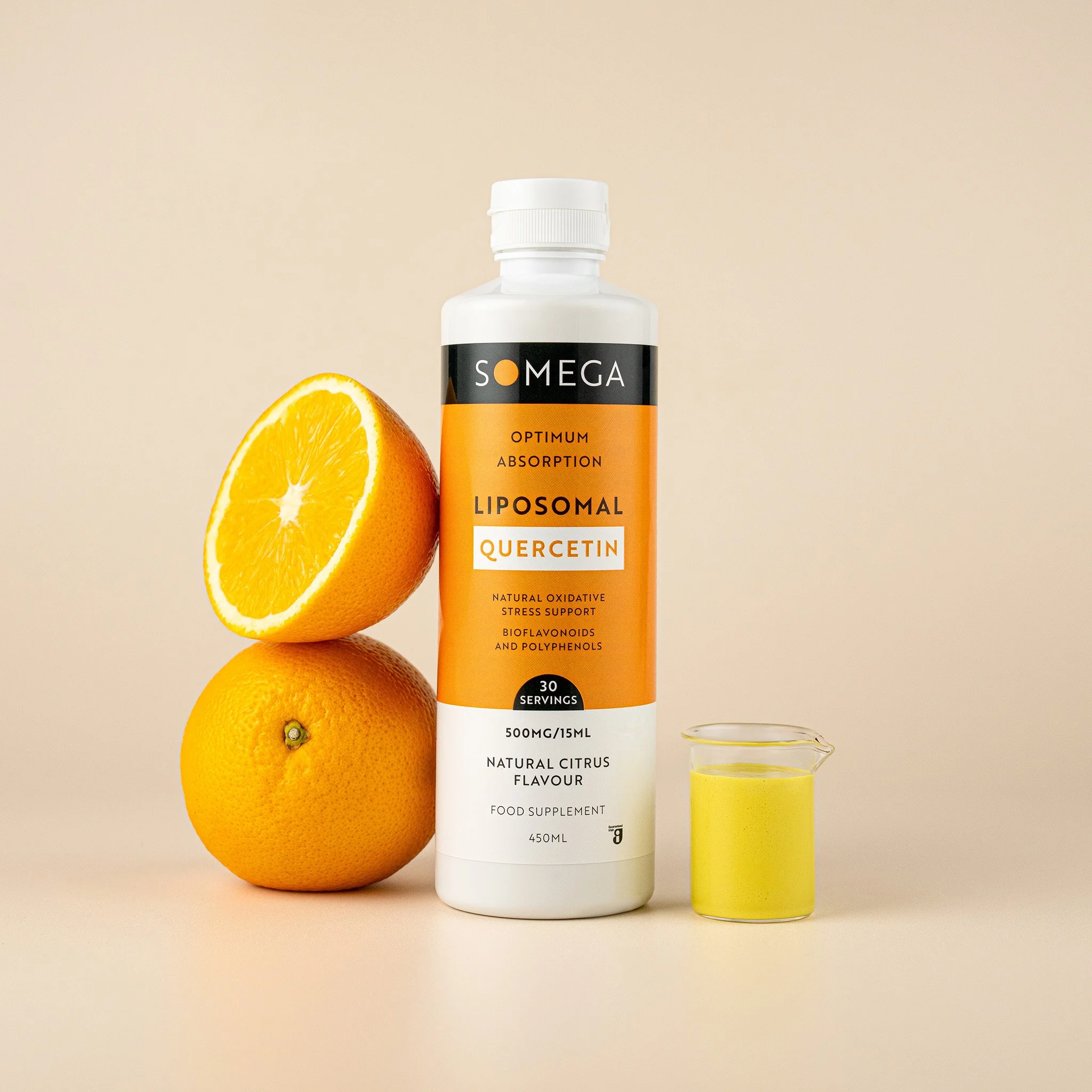
Each product has its own colour and identity, while the overall packaging system keeps the range connected. The photography follows the same principle - consistent light, composition and treatment across every new product.

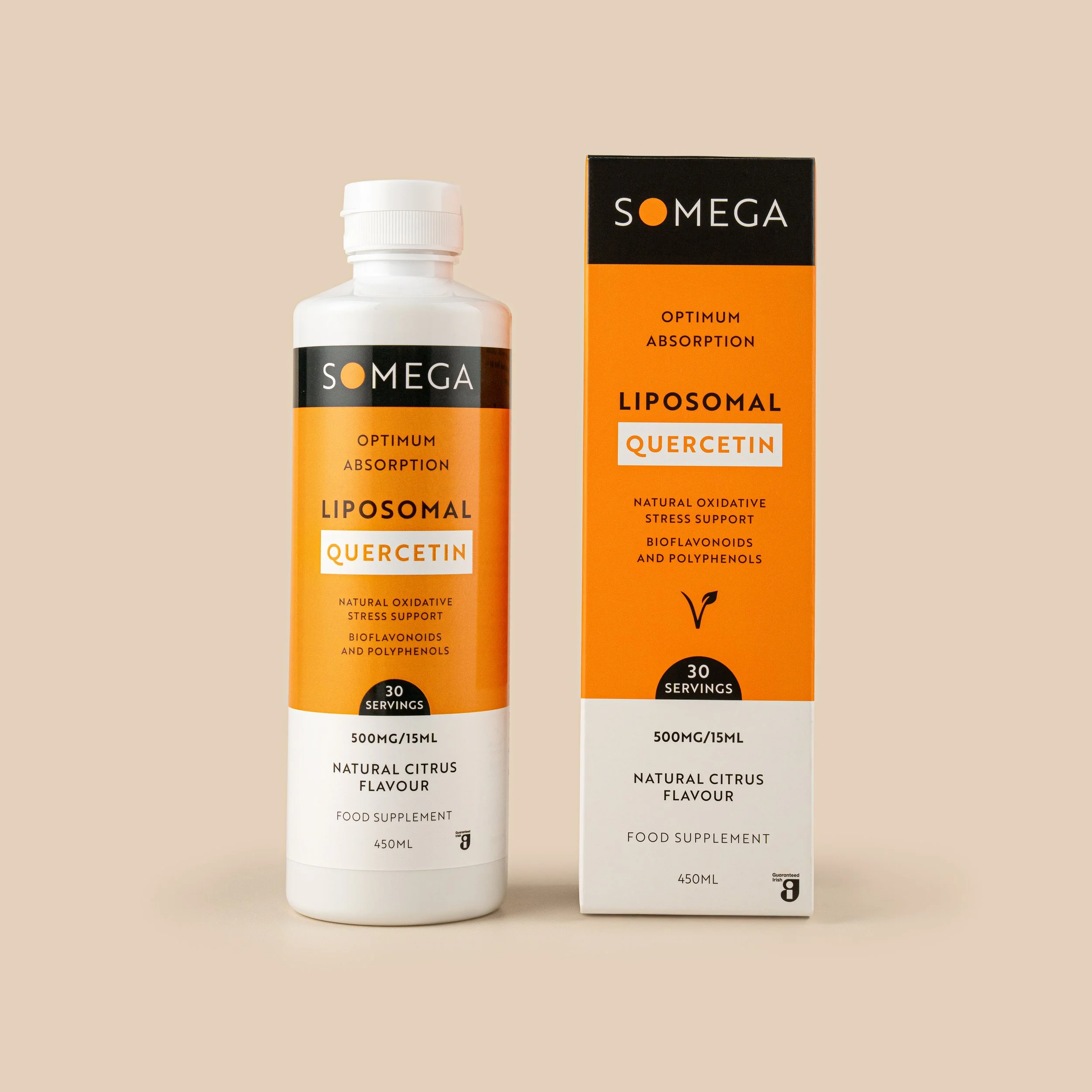
02 · E-COMMERCEConsistency starts with the essentials.
Every new product begins with clear e-commerce imagery - accurate colour, clean backgrounds and consistent angles so the entire range sits together naturally online.


03 · GETTING CLOSERDetails customers need to see.
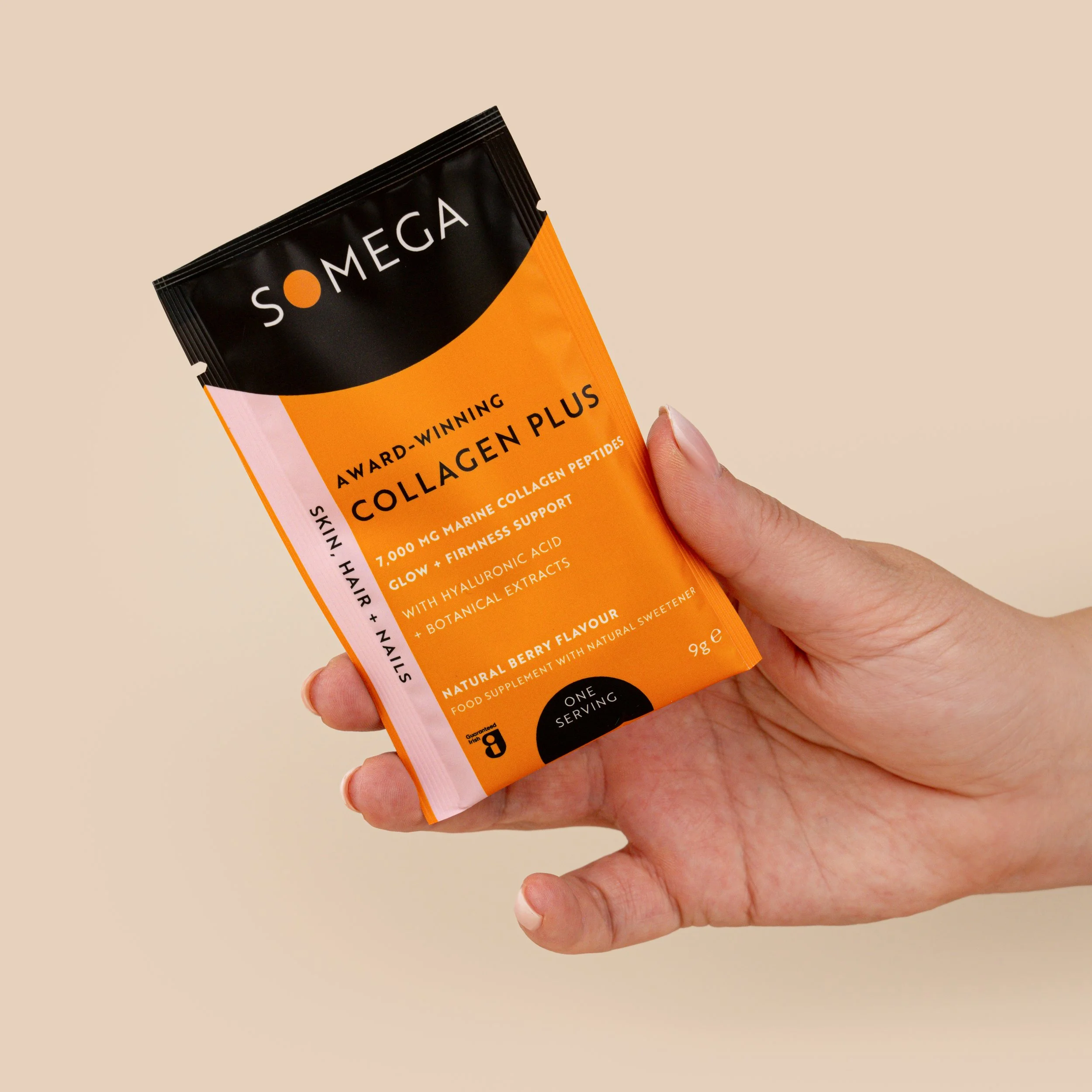
Close-up imagery brings attention to the details that can disappear in a standard product shot - packaging, powder, liquid, texture, scoop, dosage and the small features that help customers understand the product.



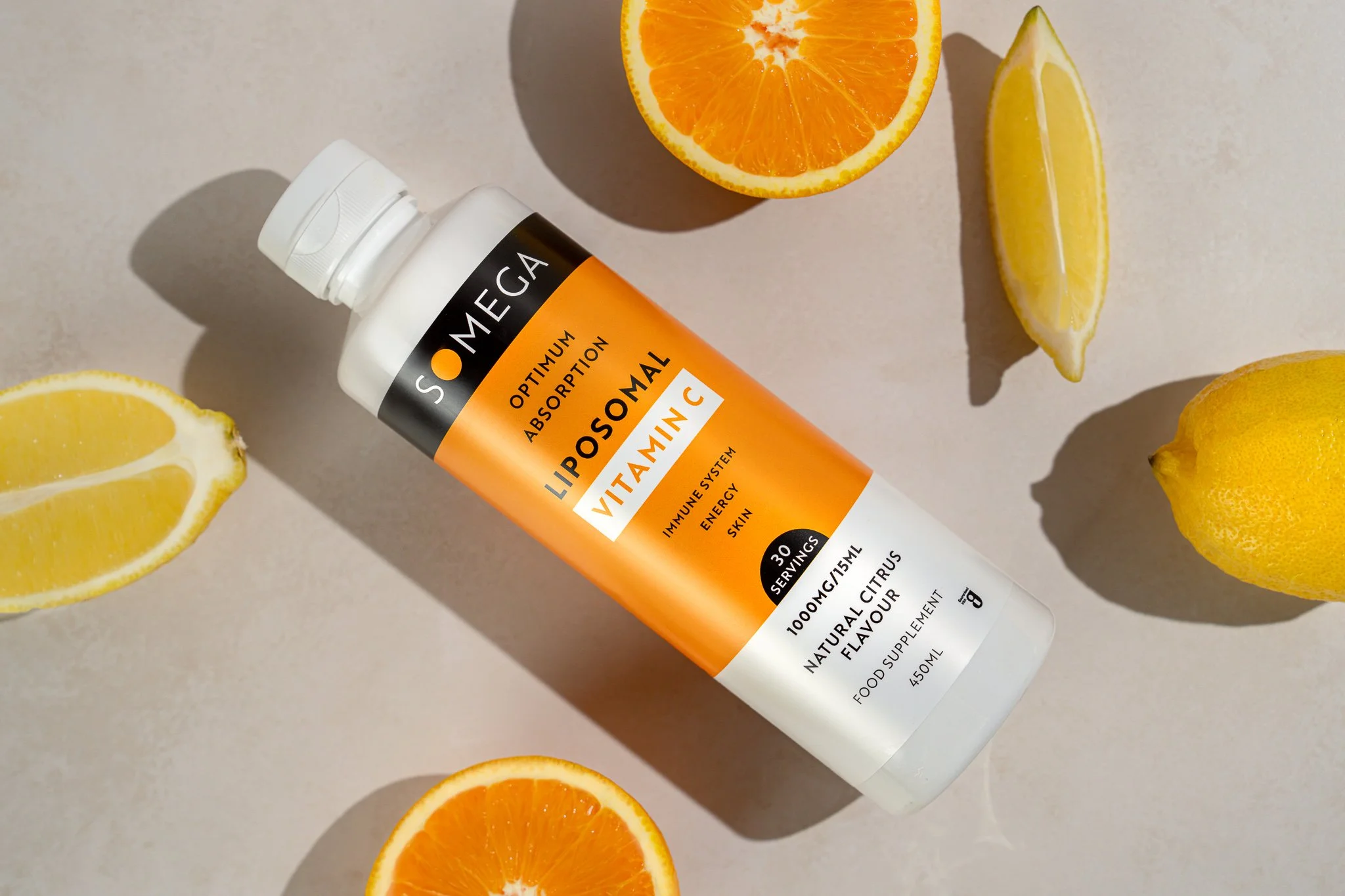
04 · MINIMAL LIFESTYLEAdd context without adding noise.
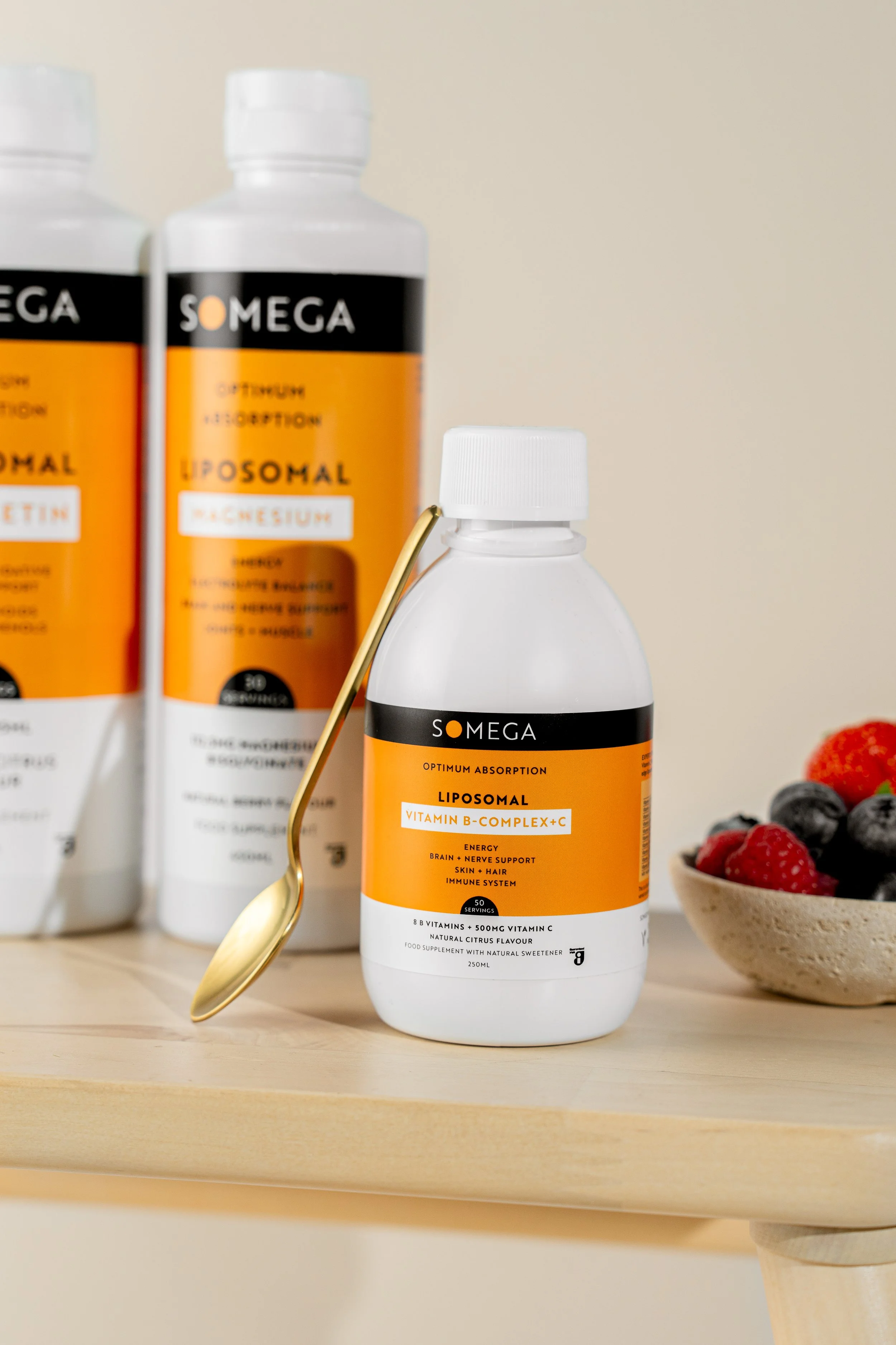
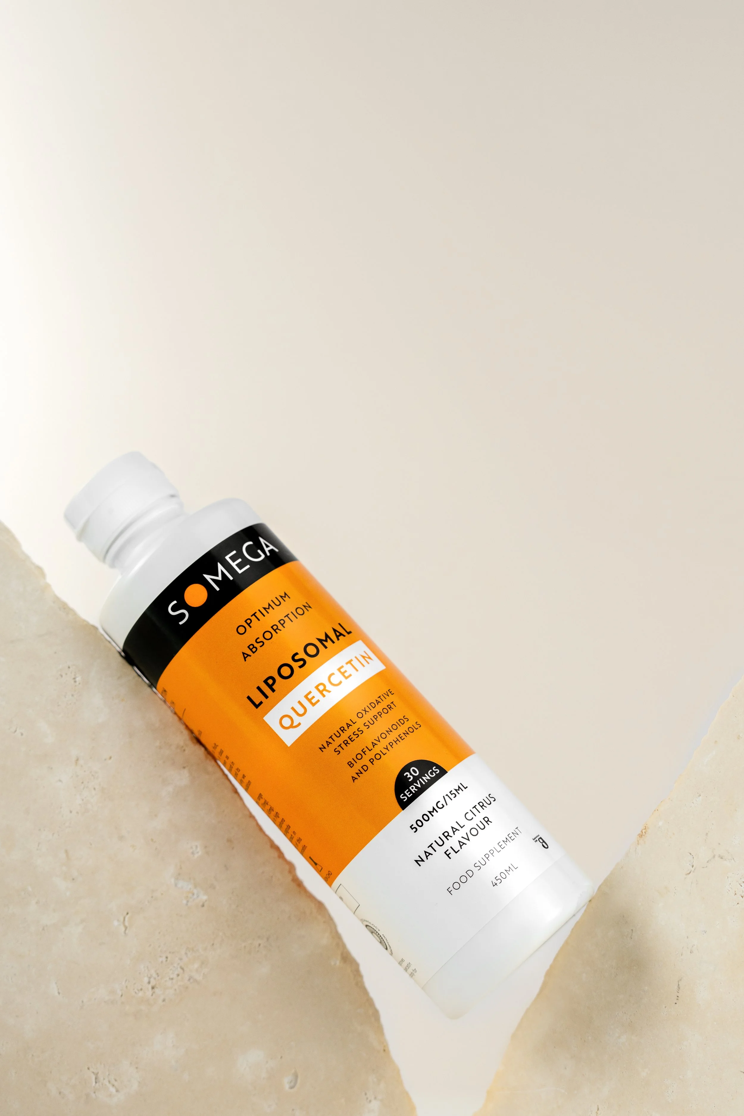
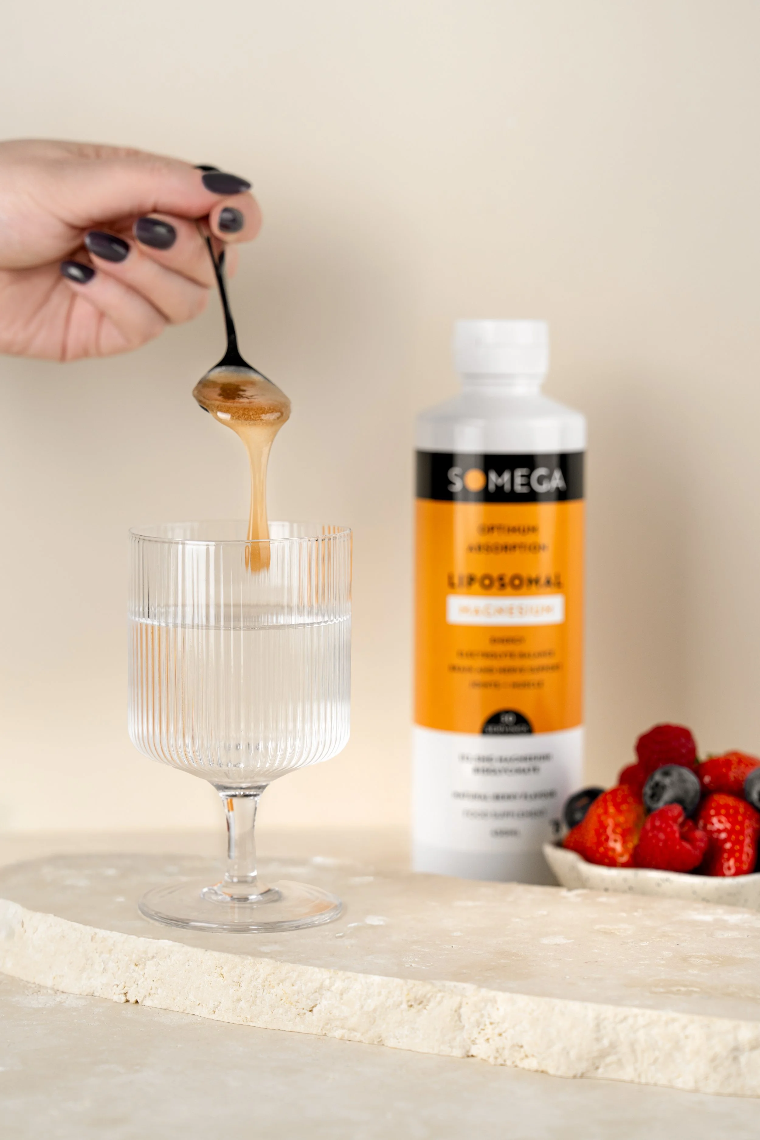
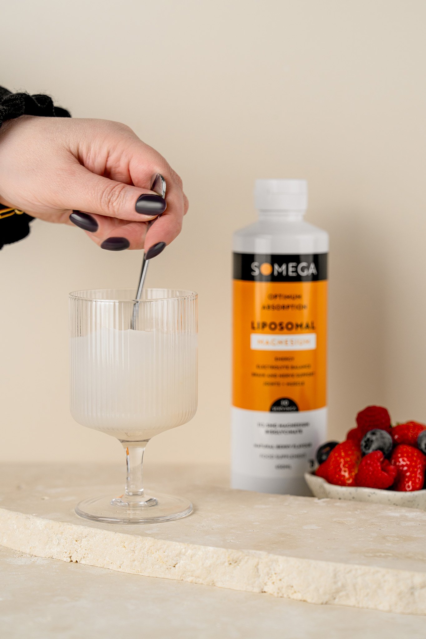
Lifestyle imagery stays intentionally minimal. Simple props, surfaces and ingredients add context while allowing the strong packaging and brand colours to remain the focus.

From product to everyday routine.
05 · SHOWING HOW IT'S USED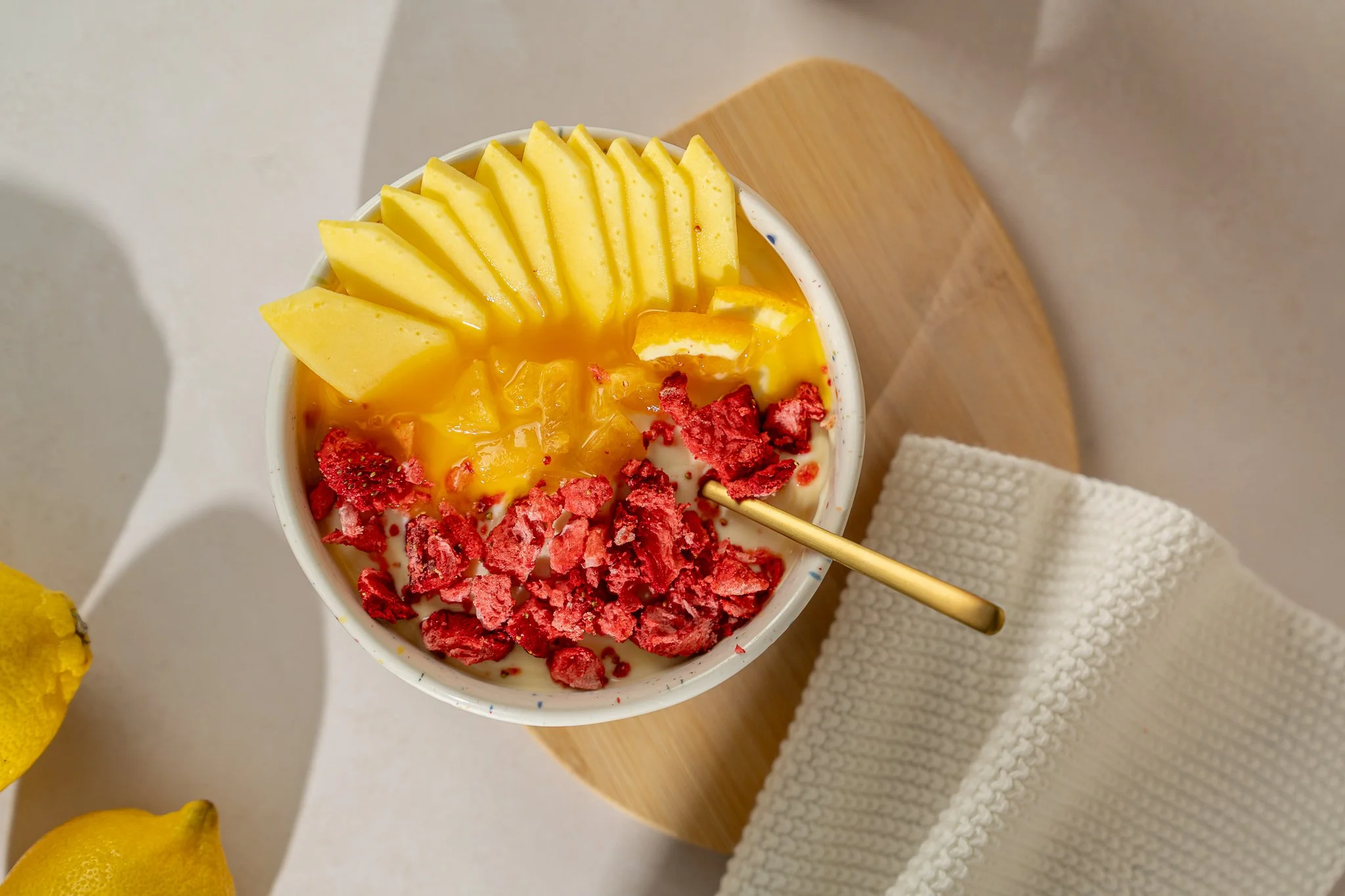



06 · SEASONAL WITHOUT LOSING THE BRANDA little change, without starting again.
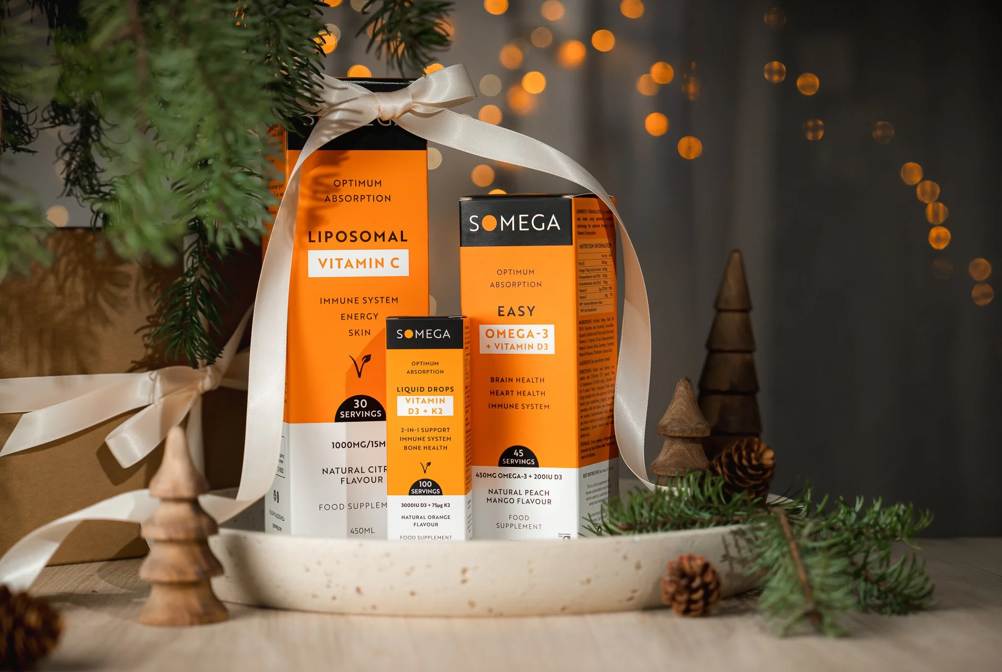
Seasonal content can change the mood without changing the visual identity. Small styling cues give the imagery a new purpose while the products still feel unmistakably Somega.


Photography built to work.
From individual product pages to launches, bundles and everyday content, the goal is a library that stays useful long after each shoot.