· AWAY WITH NATURE ·Colour, calm
and consistency.
An ongoing visual partnership built around a simple idea: let every product have its own colour while keeping the whole collection unmistakably connected.
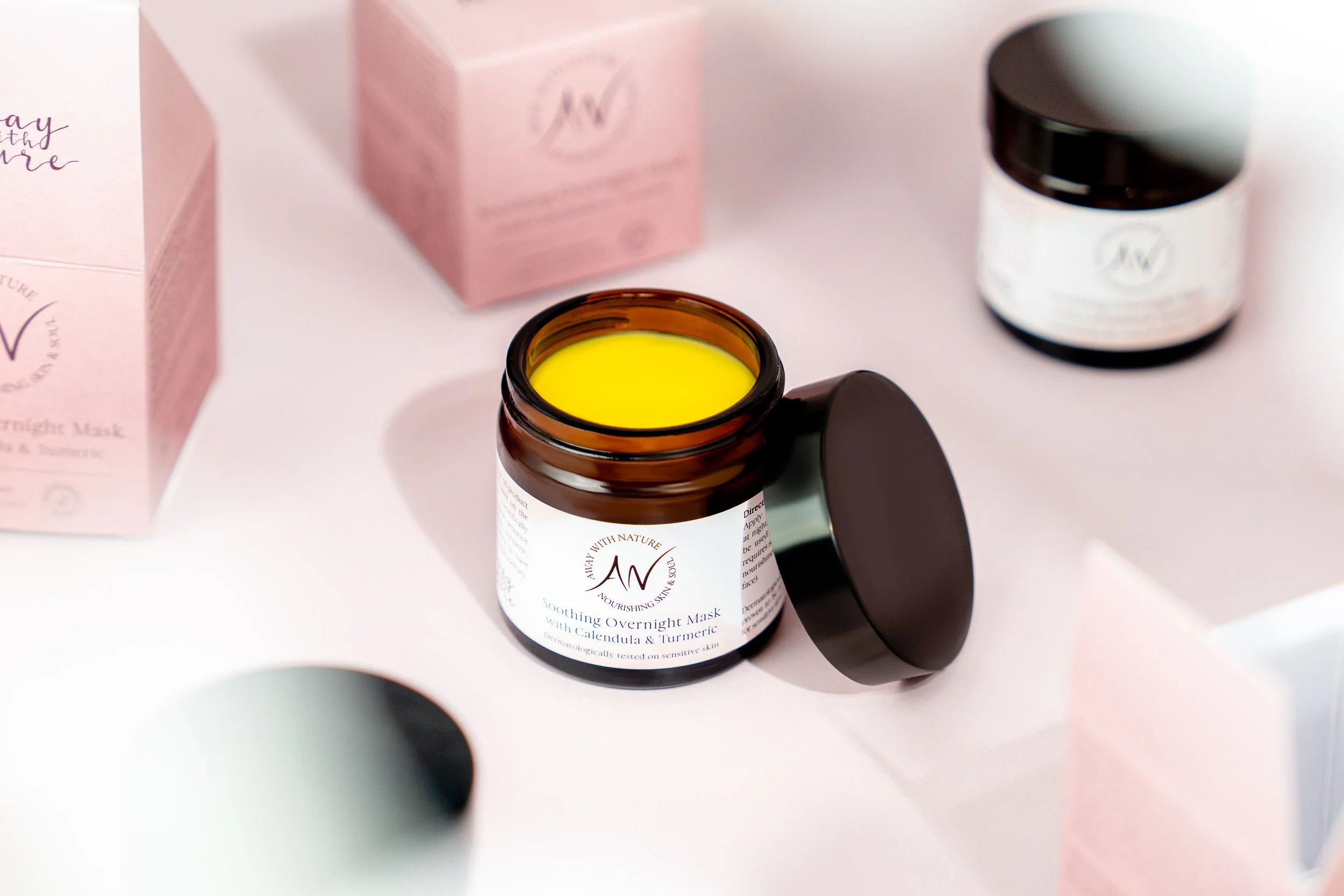
01 · GROWING TOGETHERNot one shoot.
A visual language built over time.
Fiona was one of my first product photography clients. As Away With Nature grew, the photography grew with it - without starting from zero every time a new product arrived.
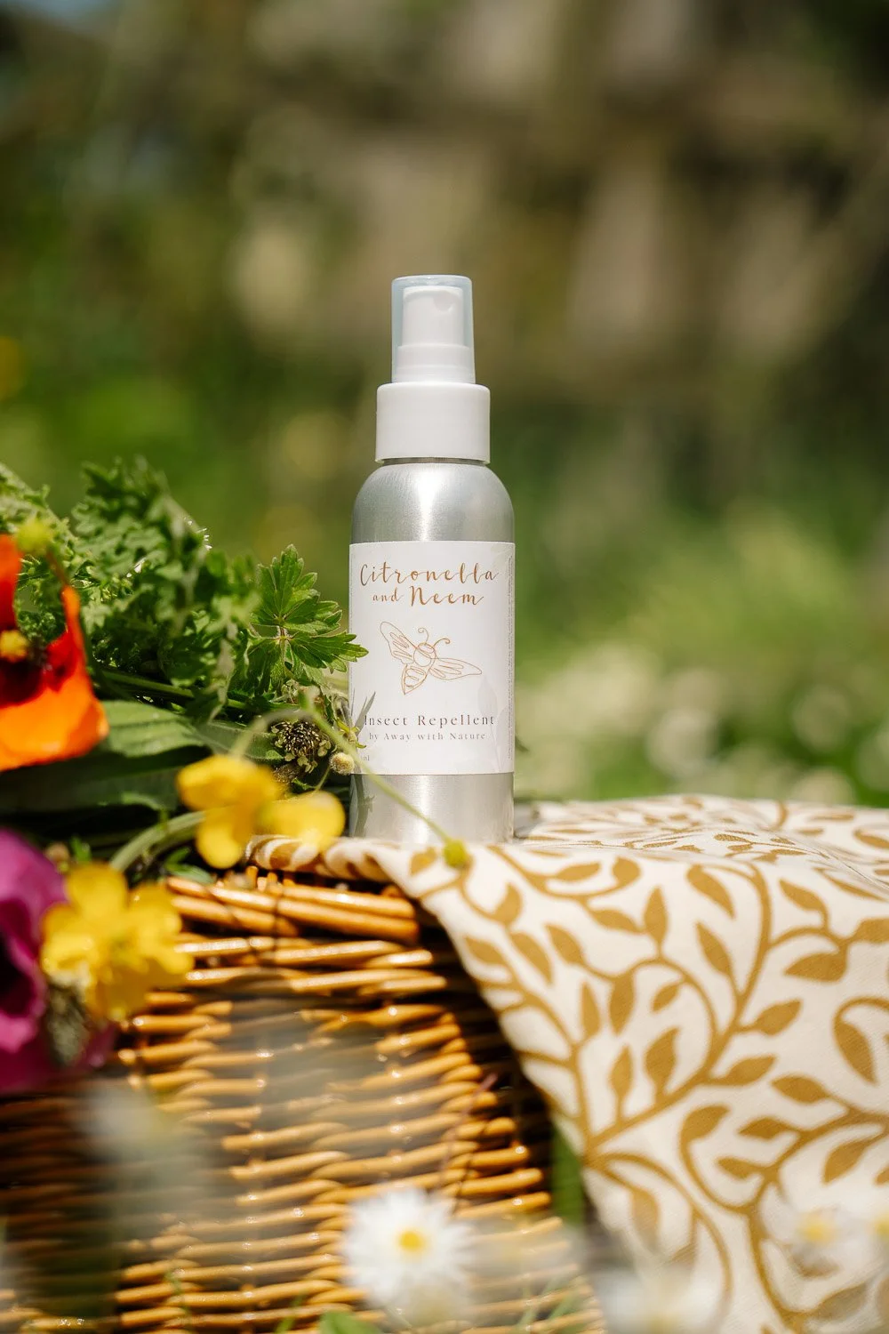
02 · COLOUR AS IDENTITYEvery product gets its own colour.
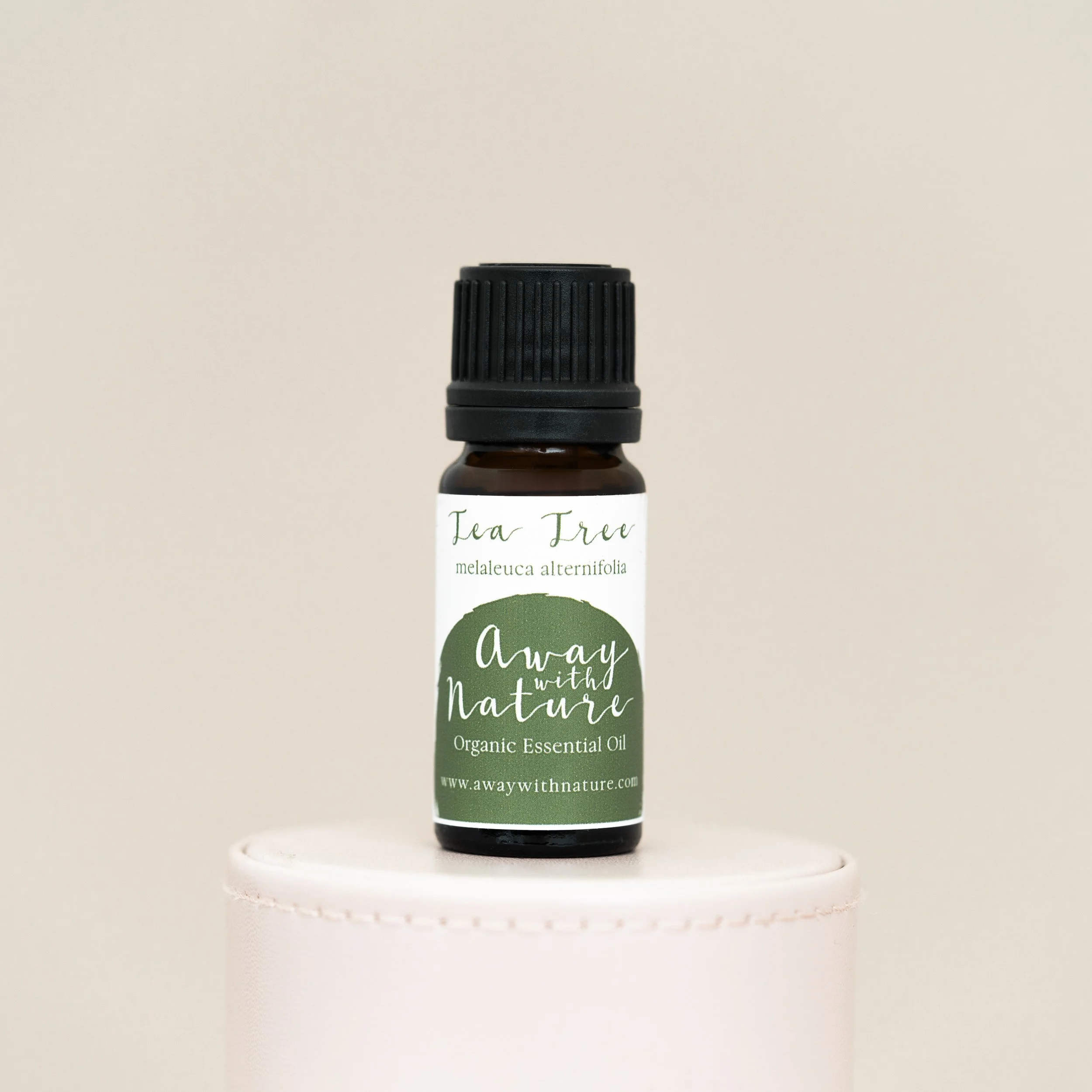
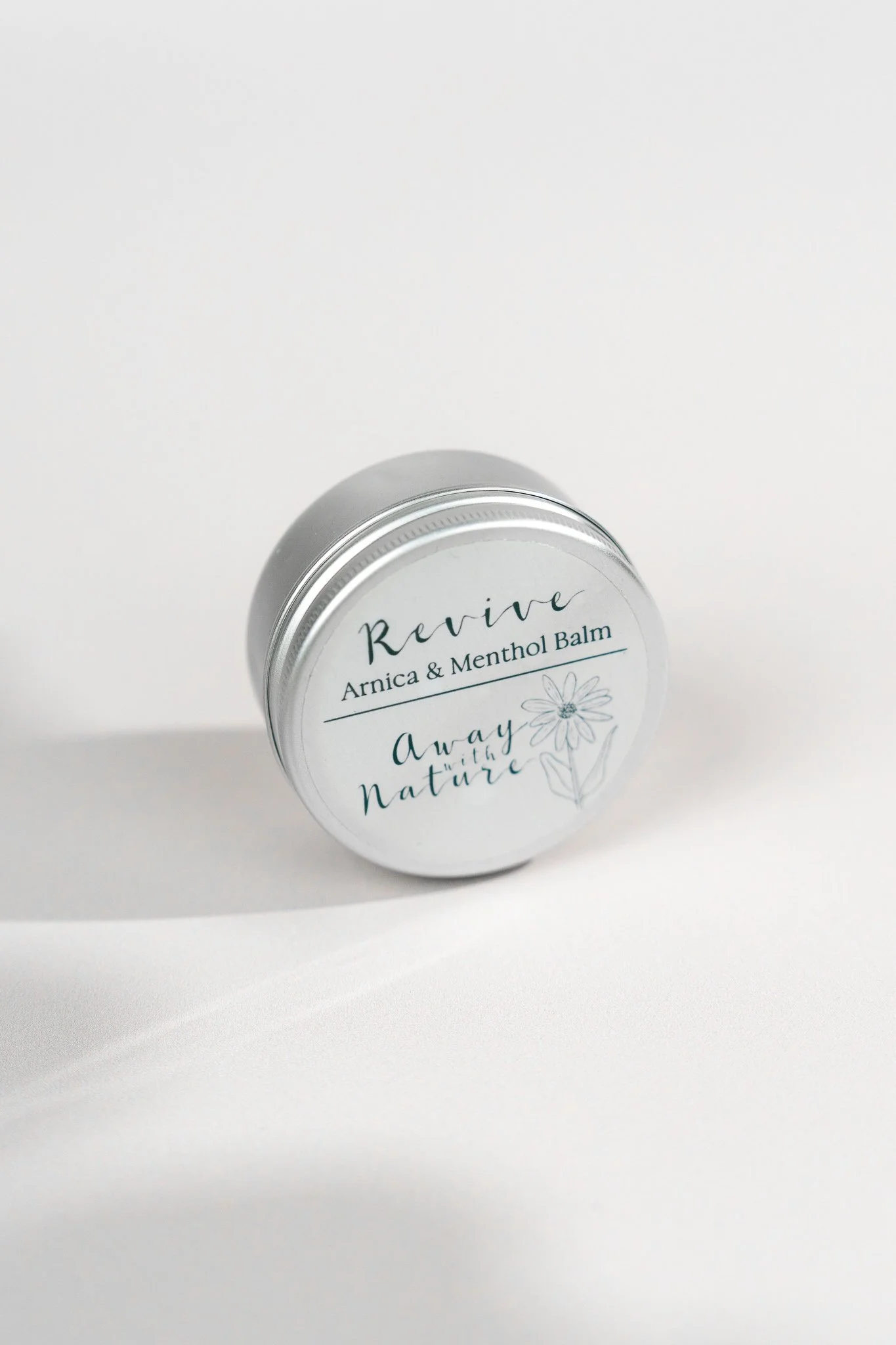
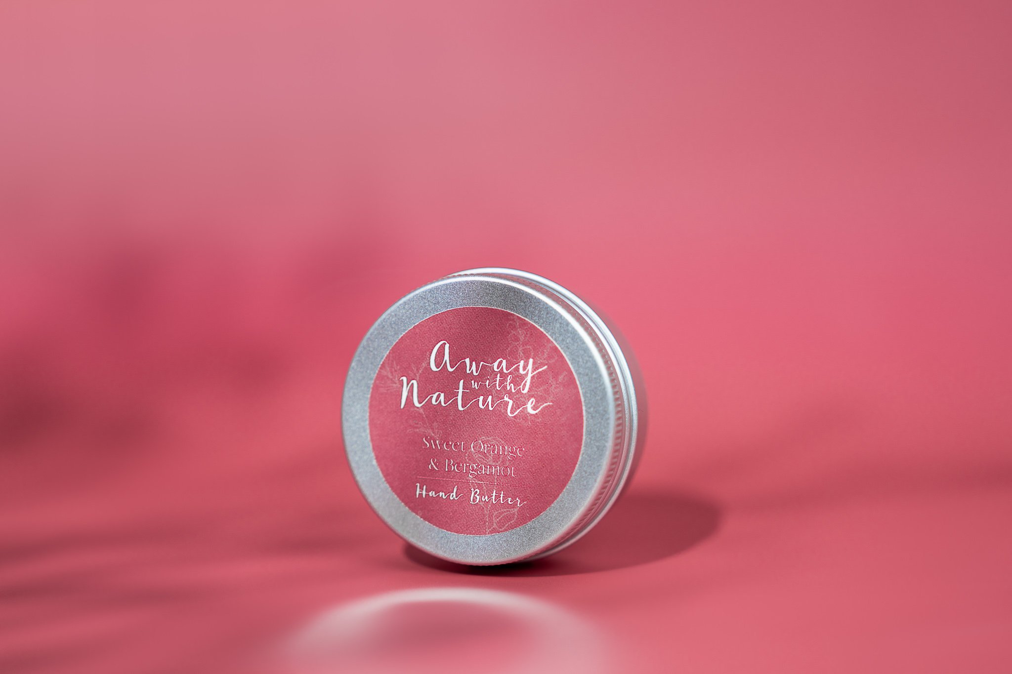
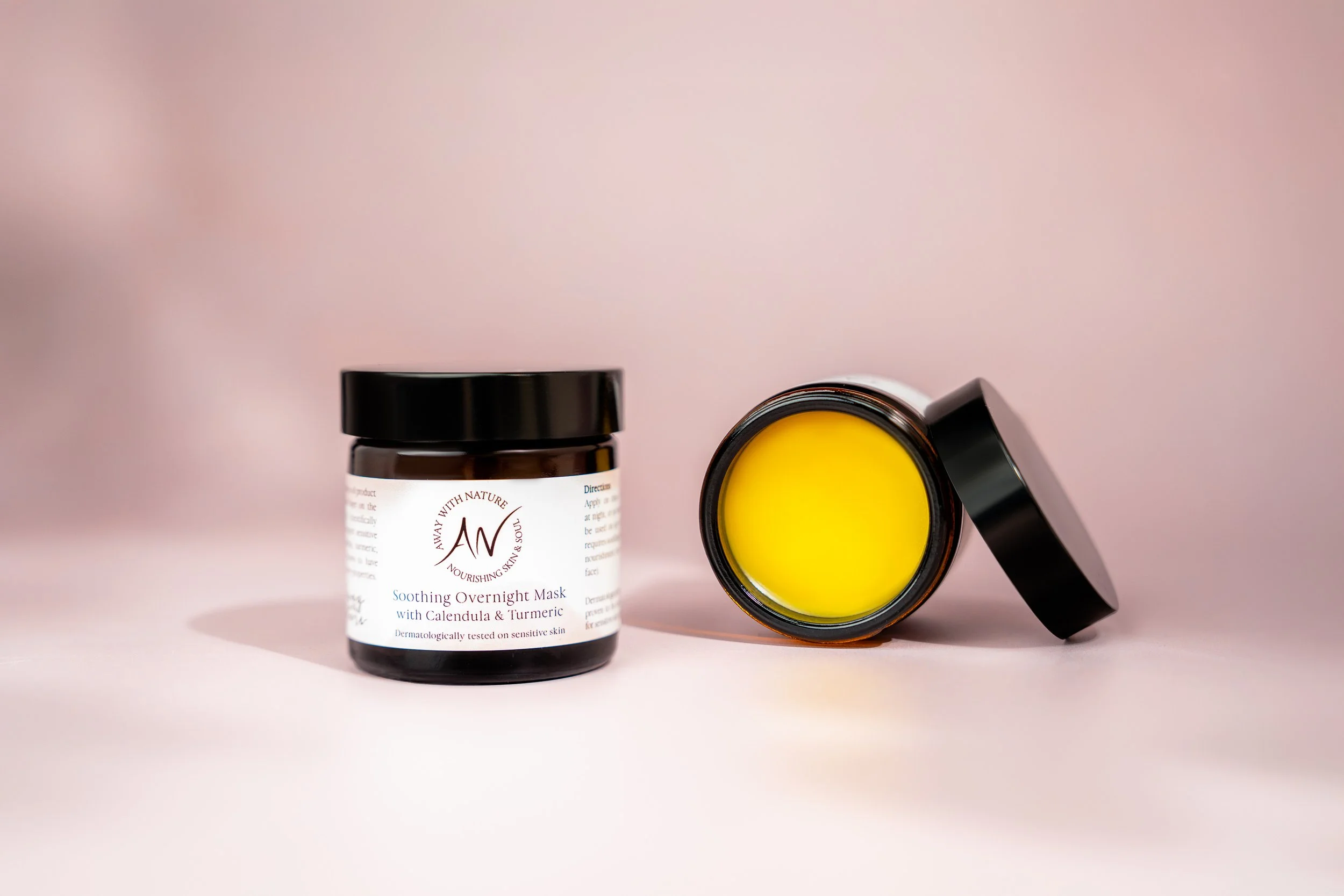
We take the colour cues from each label and carry them into the set, creating tonal backgrounds that give every product personality while keeping the collection visually connected.
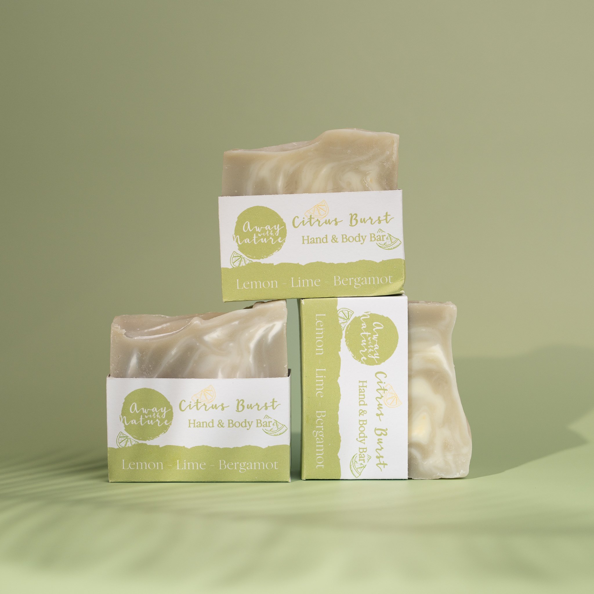
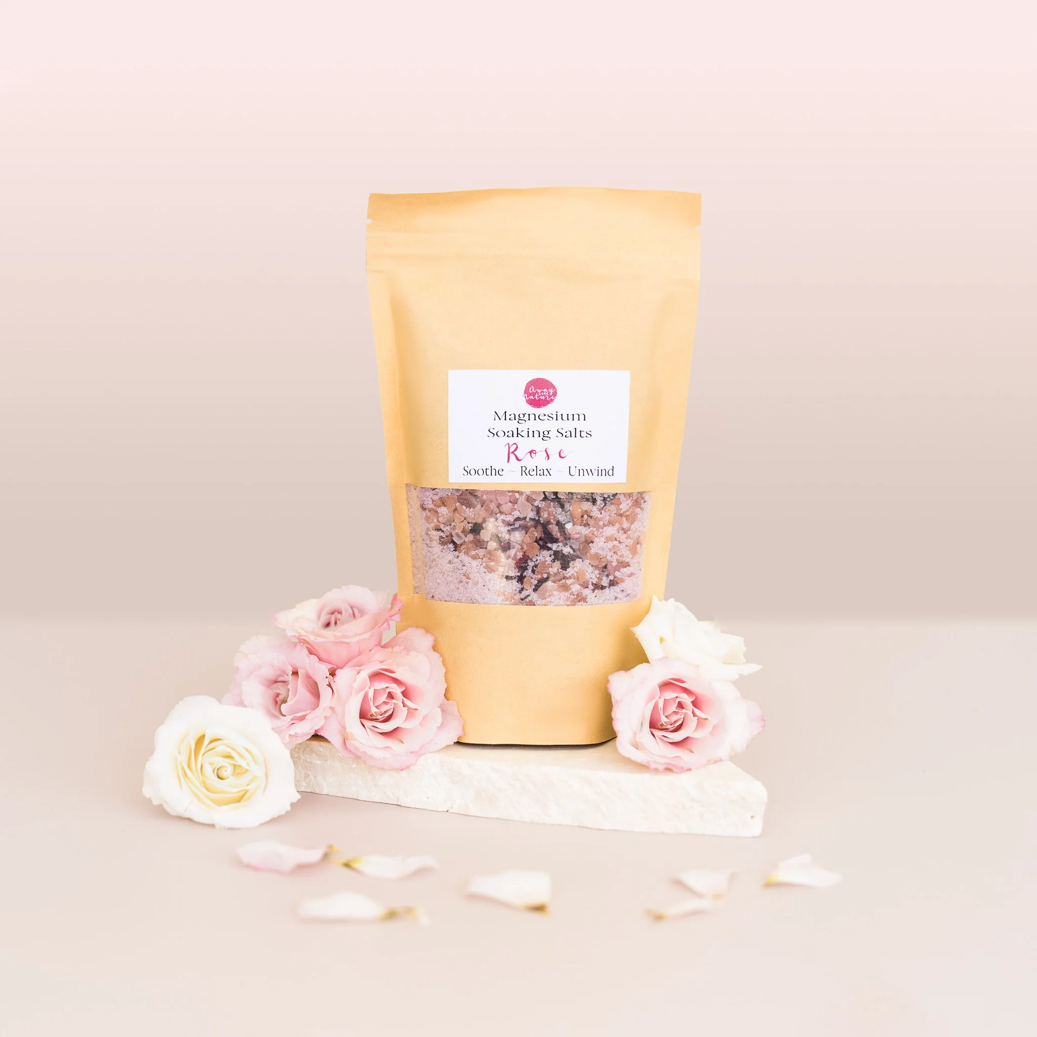
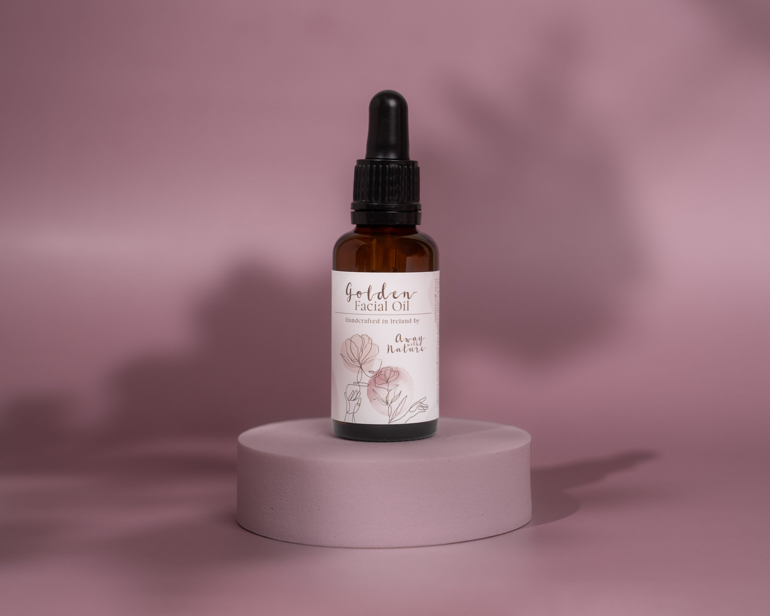
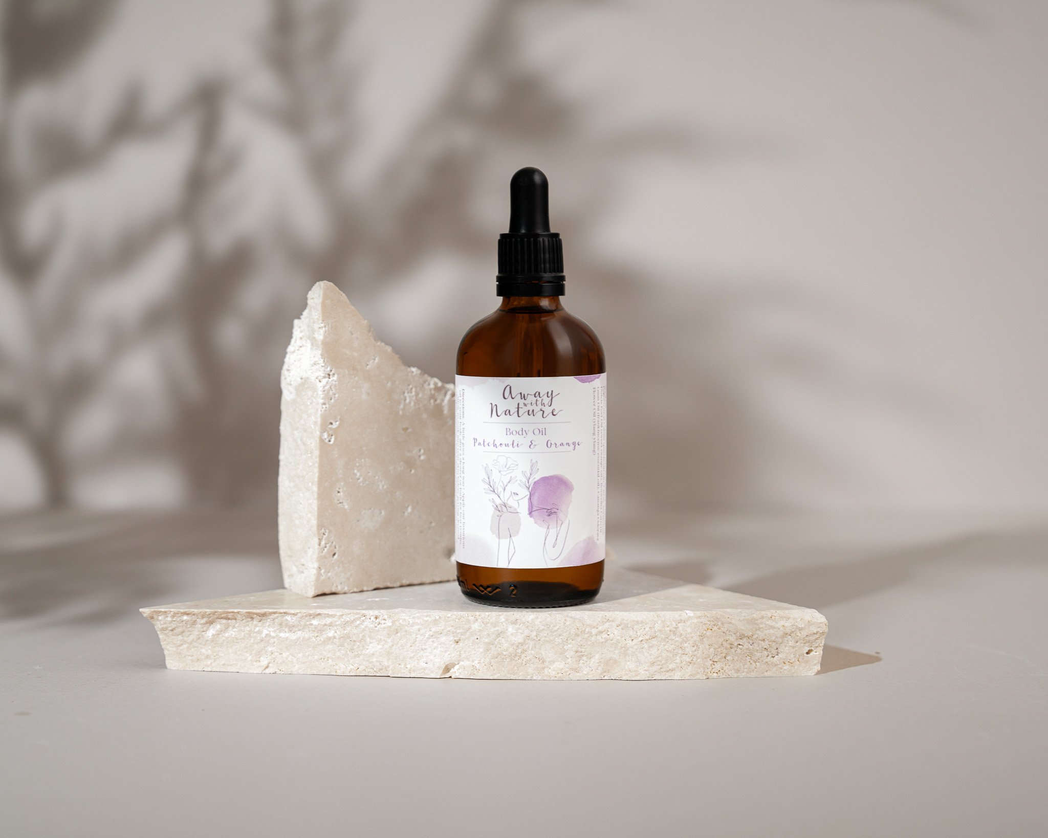
03 · KEEPING IT SIMPLESimple doesn't mean empty.
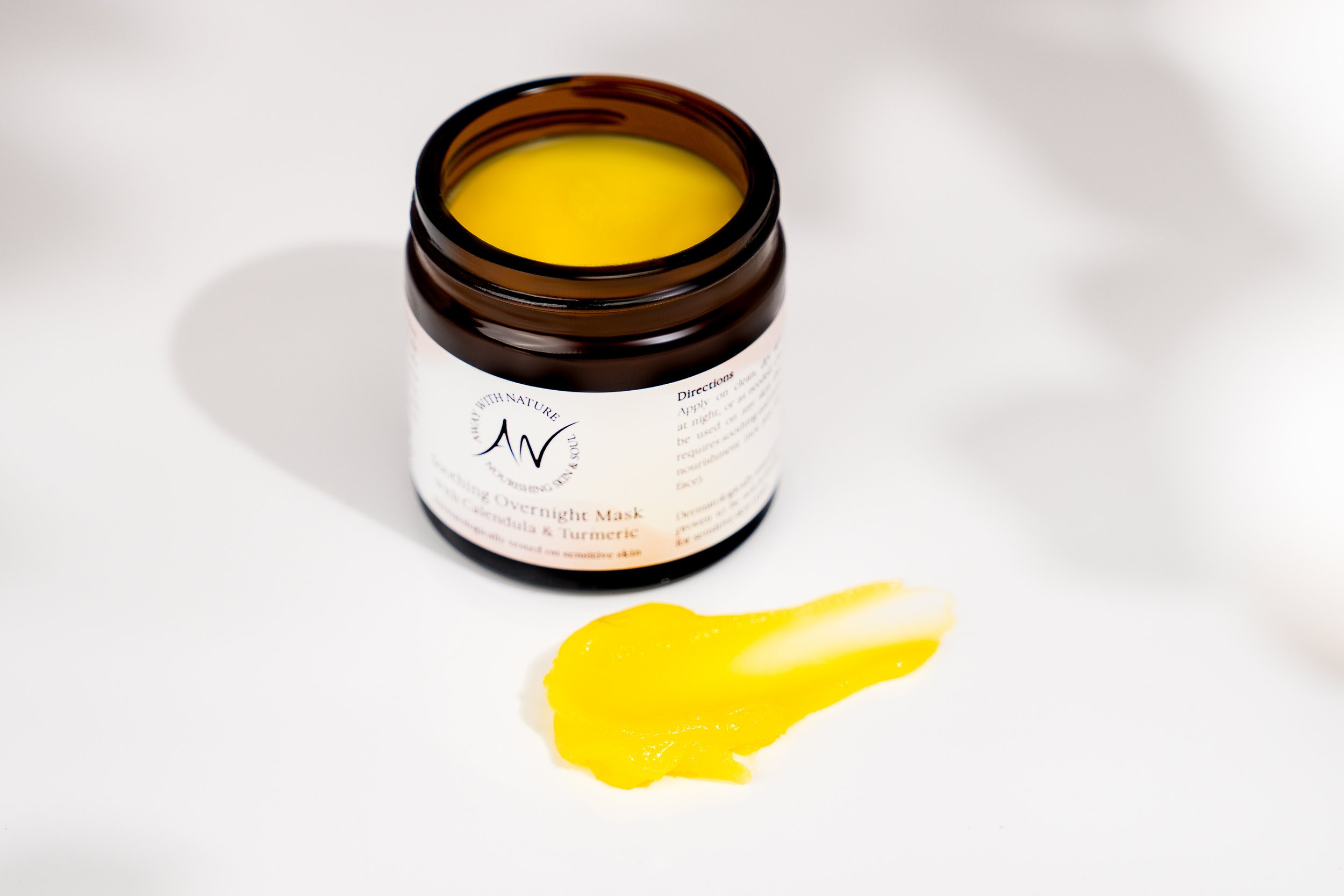
Rather than filling each set with props, colour, shape, light and shadow do most of the work. The product stays the hero.
04 · TEXTURE + DETAILThe feeling is in the details.
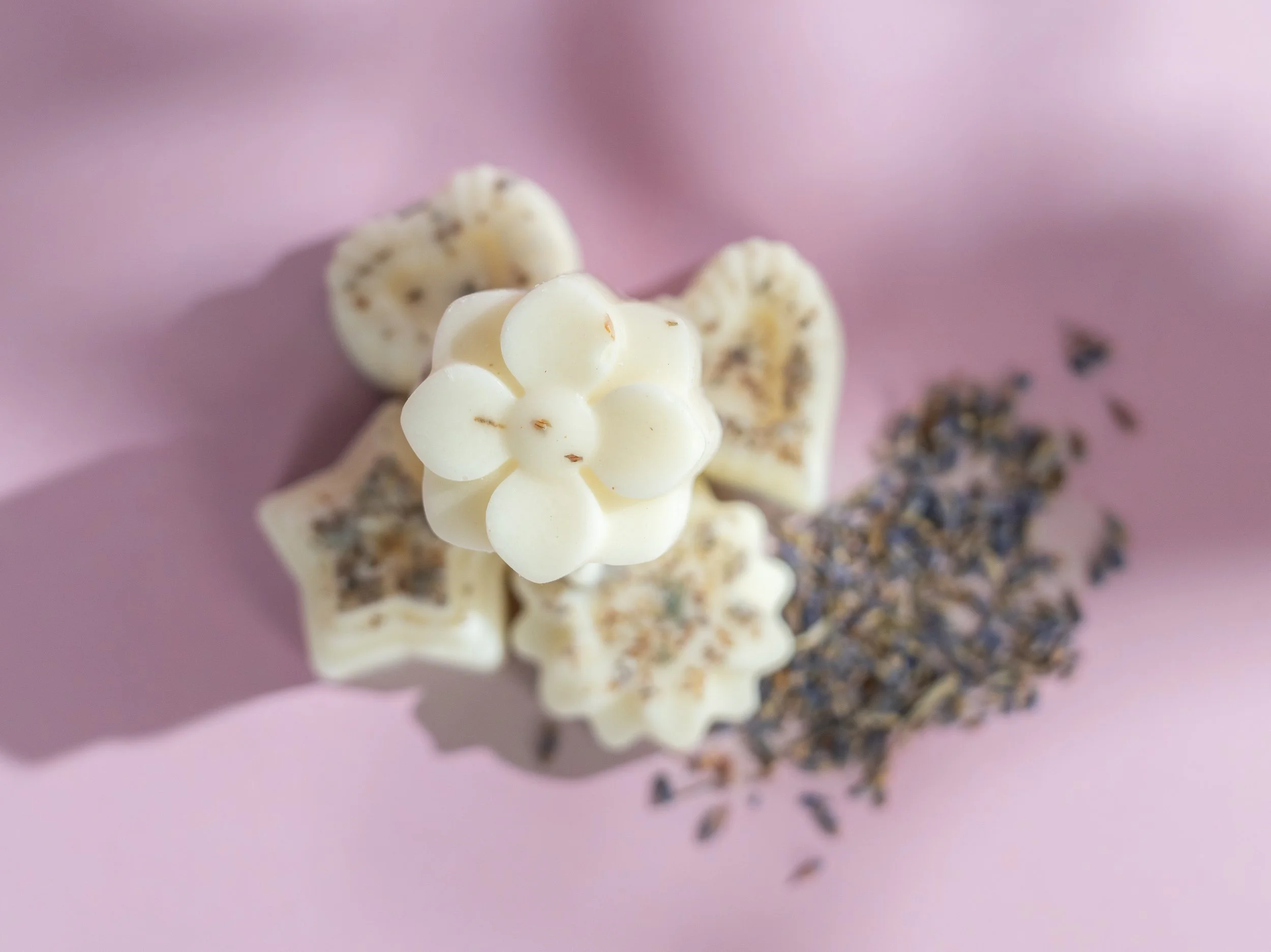
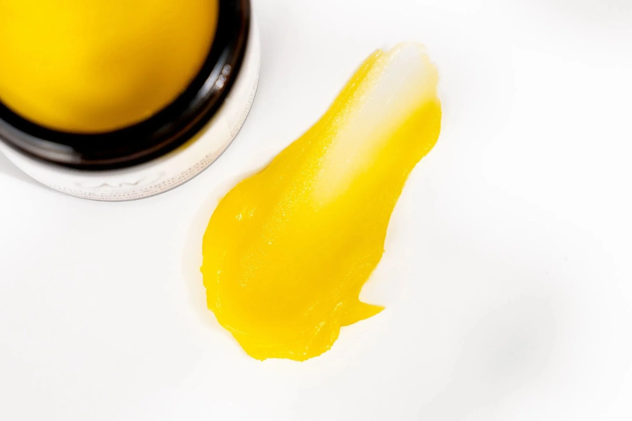
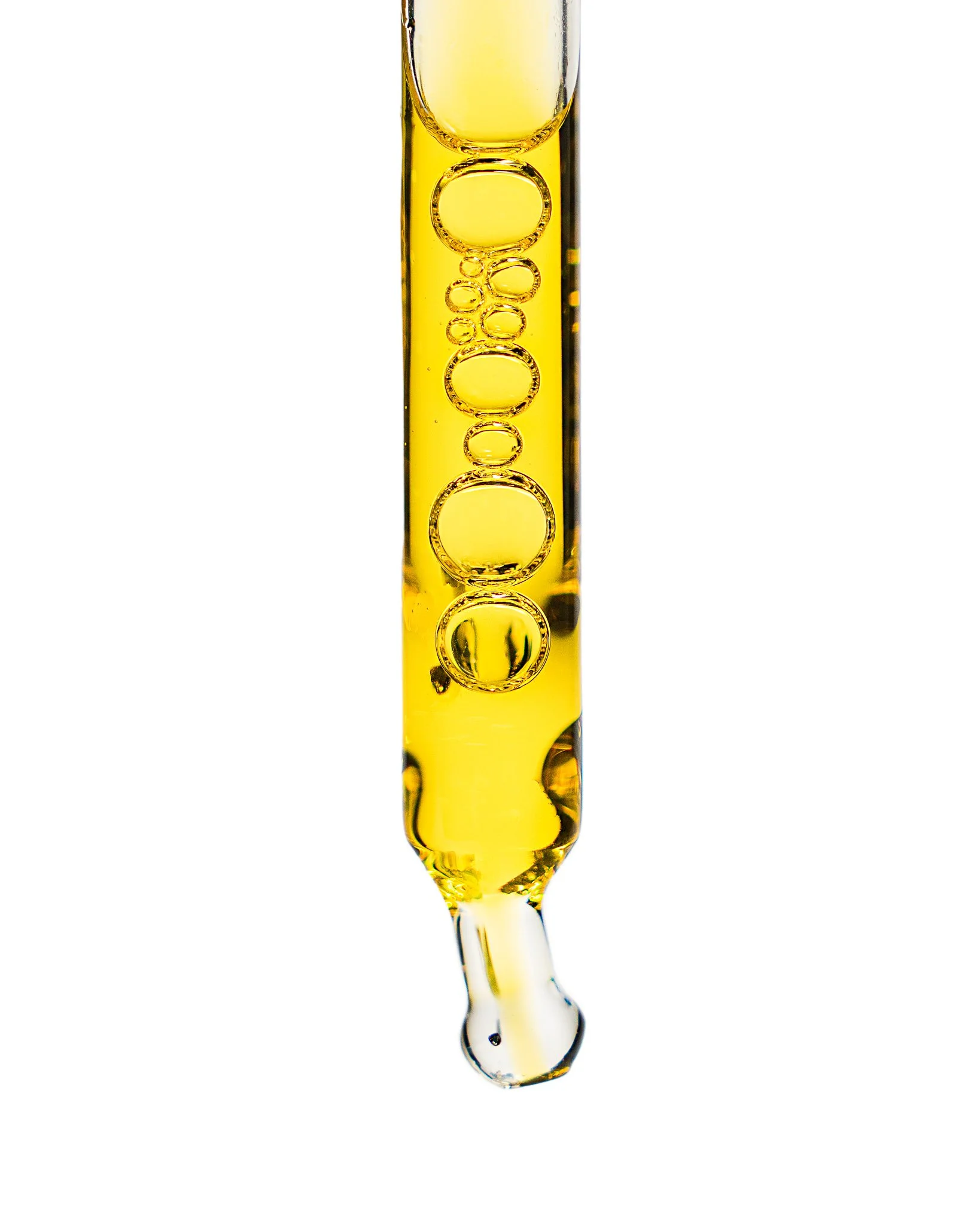
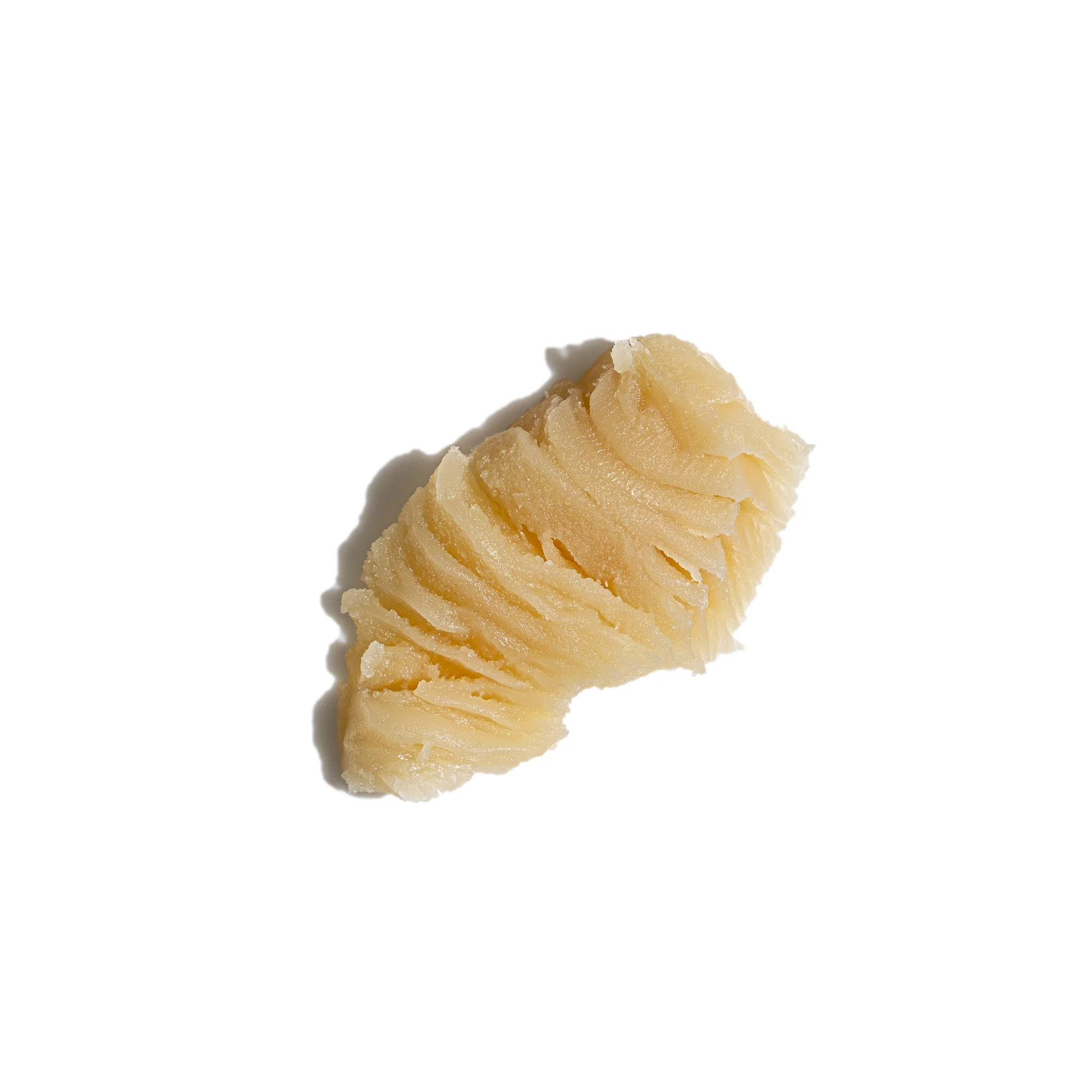
For skincare, texture is part of the story. Close-up imagery shows the richness, consistency and finish of the products while adding another layer to Away With Nature’s visual library.
05 · BEHIND THE BRANDThe products are only
part of the story.
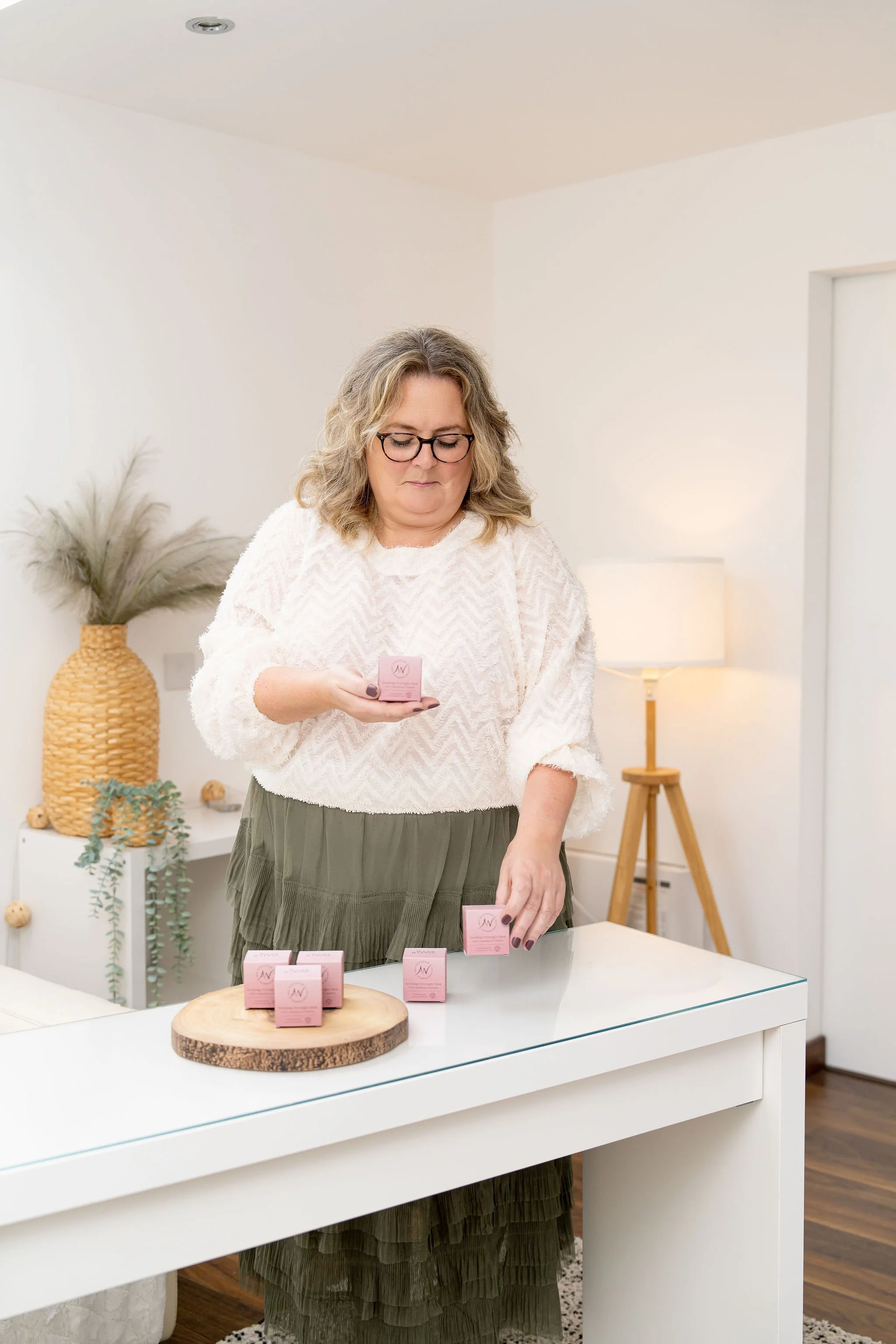
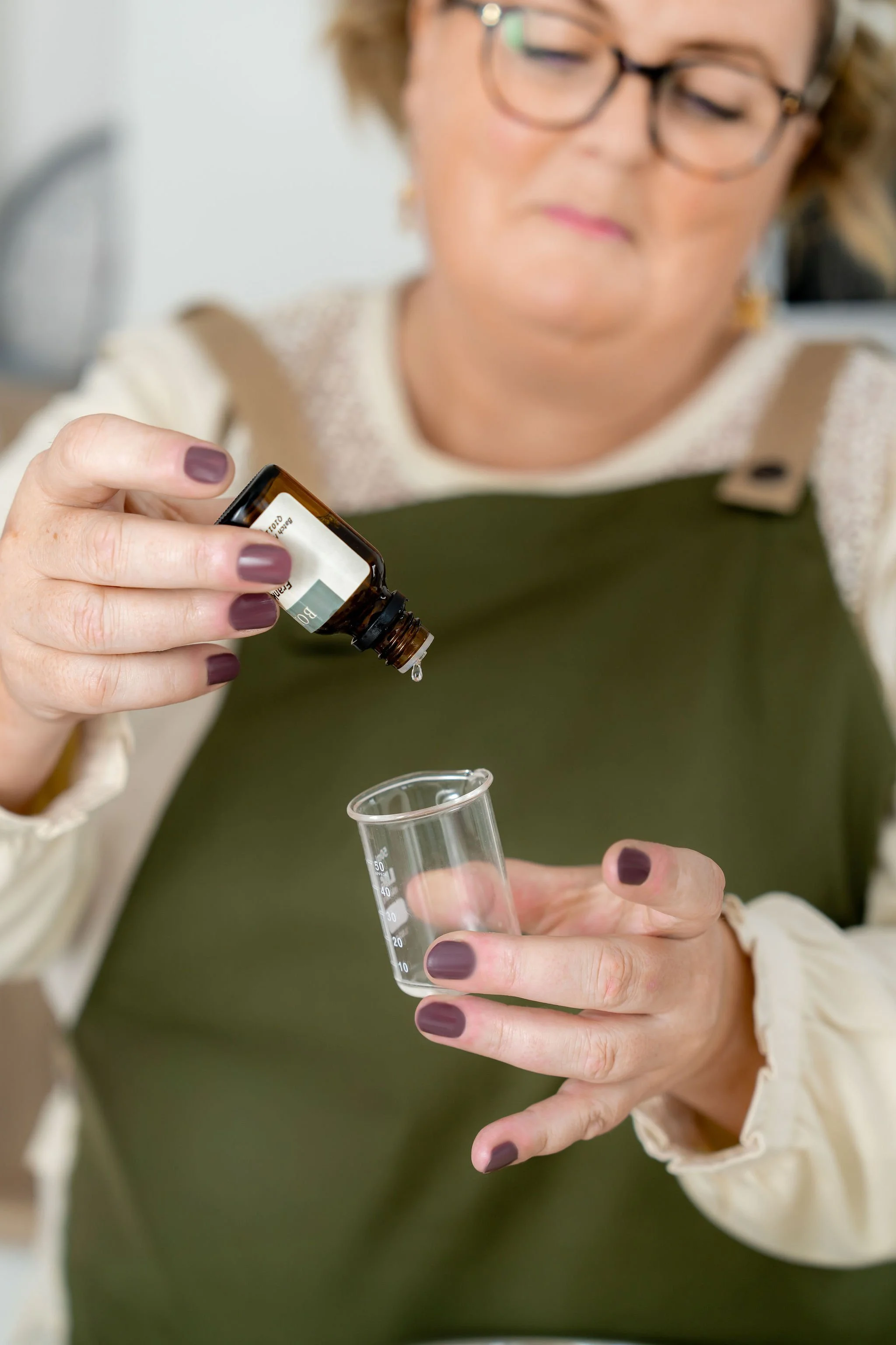
From the lab where the creams are made, to the markets where Fiona meets her customers and the studio where we create her brand imagery - the story continues beyond the product table.
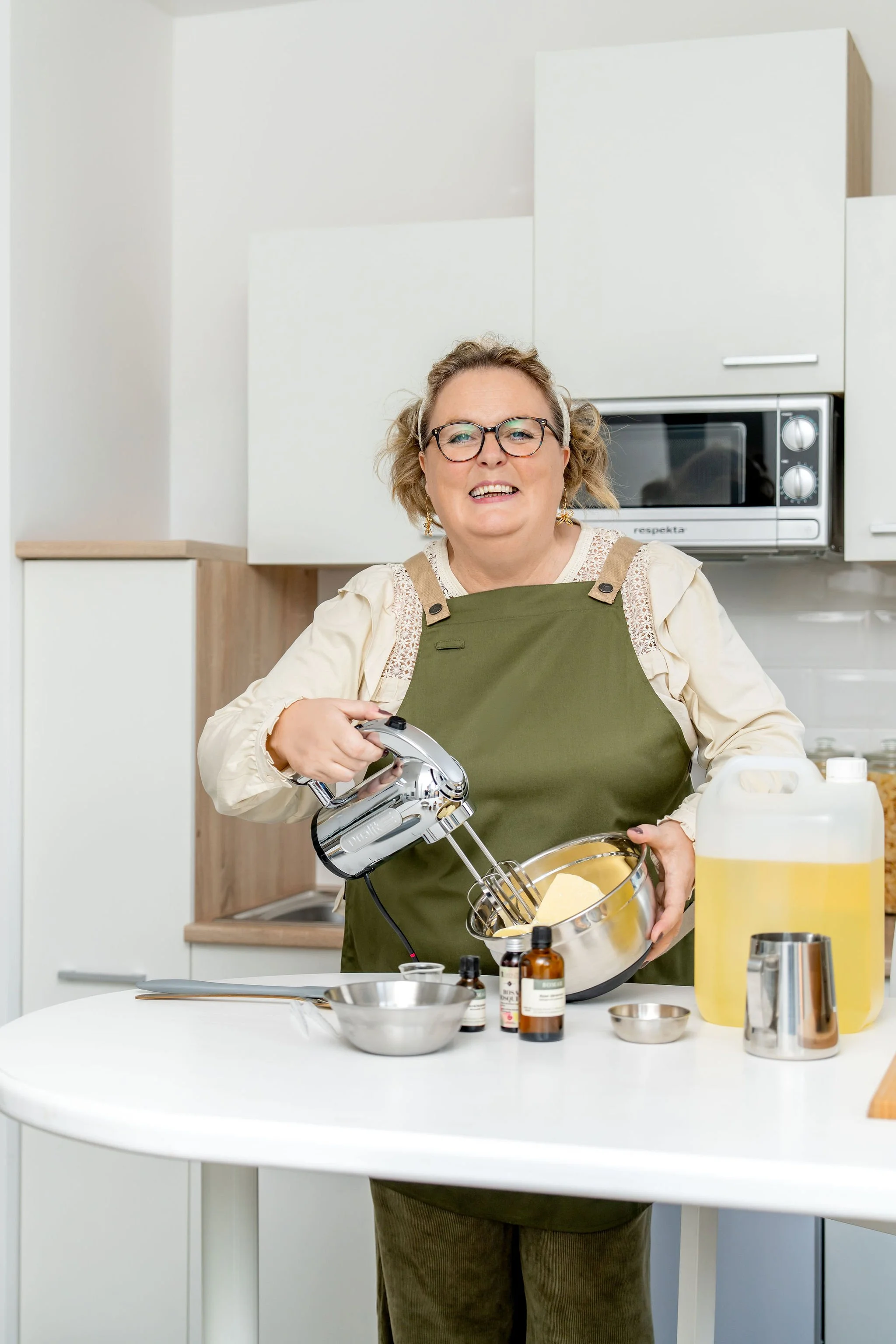
01 · THE PERSON BEHIND THE BRAND
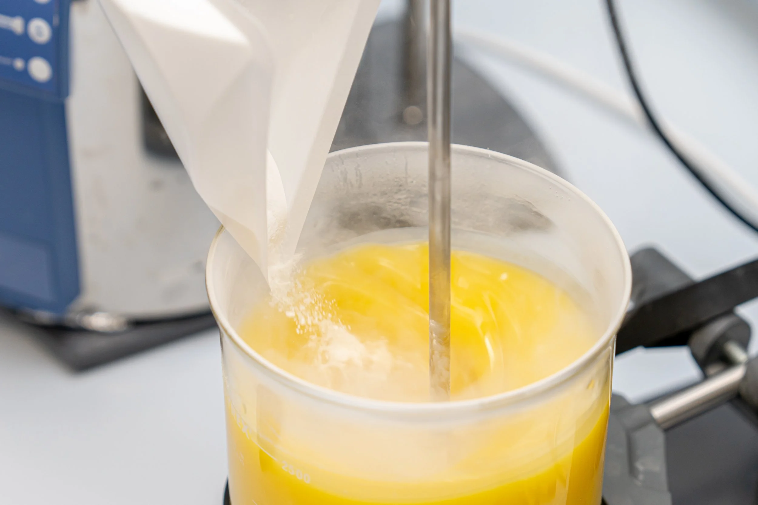
02 · THE MAKING PROCESS
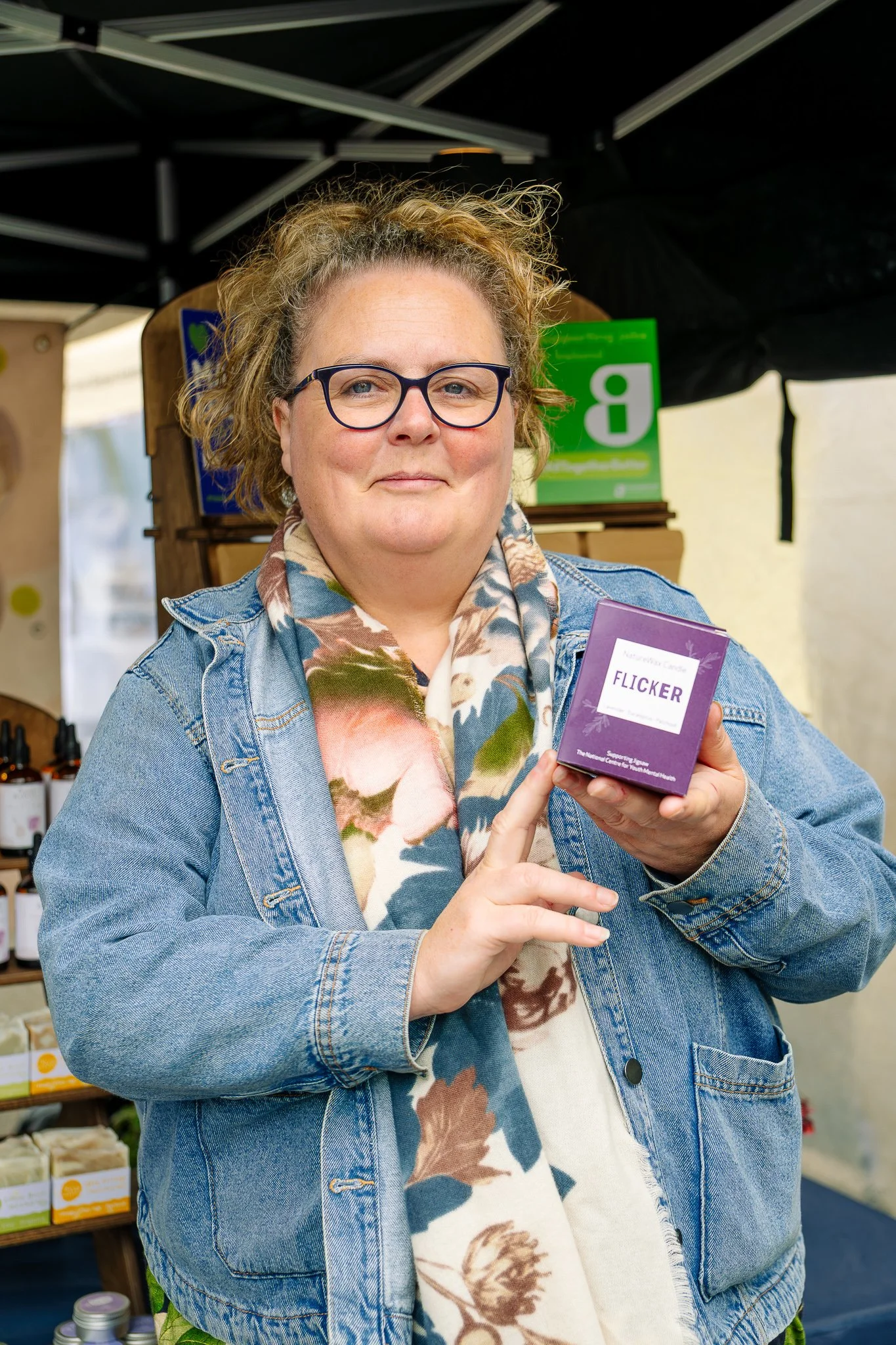
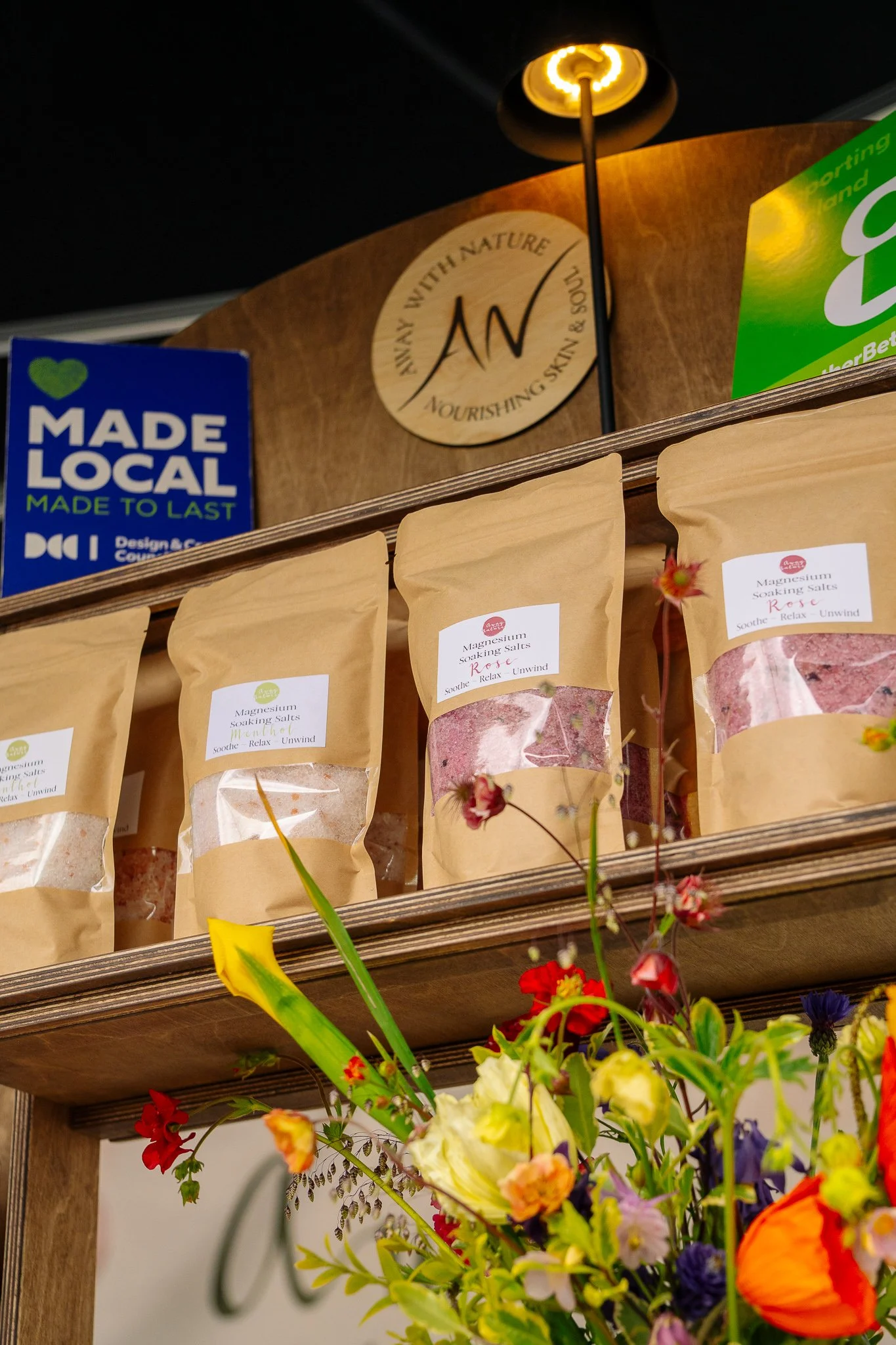
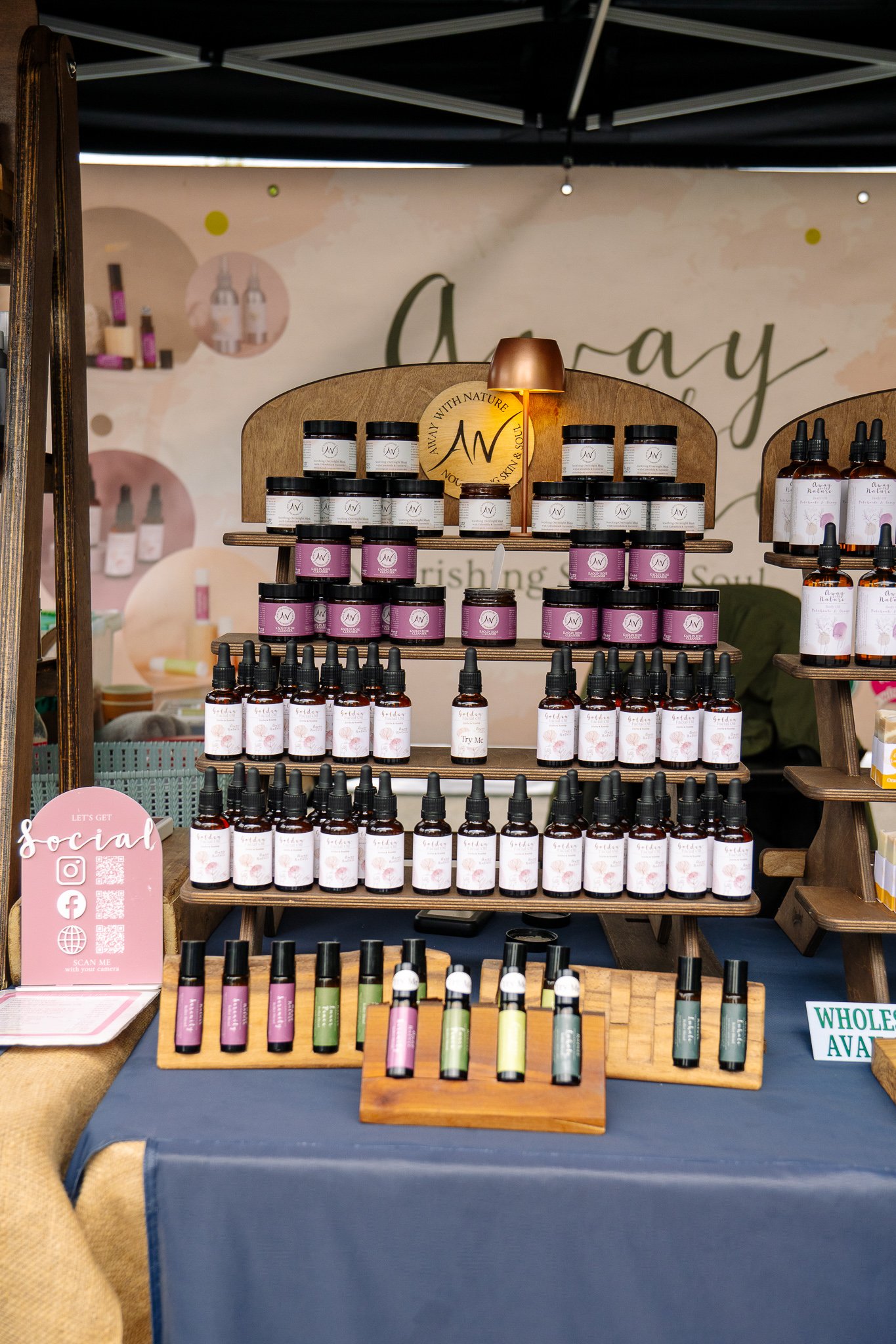
03 · WHERE THE BRAND MEETS ITS CUSTOMERS
Still images tell the story. Motion adds another layer.
06 · BRINGING PRODUCTS TO LIFEShort-form video brings movement, texture and process into the visual library - creating content that works alongside the photography rather than feeling separate from it.
YEARS OF IMAGES. ONE RECOGNISABLE BRAND.
What started as one of my earliest client relationships has grown into an ongoing visual library - evolving with the brand while keeping the same sense of colour, simplicity and calm.